I led the design and execution of visual communication across print and digital platforms, while also directing photo and video shoots and mentoring interns—experiences that strengthened my leadership and art direction skills. Always looking to push creative boundaries, I introduced interactive elements to the company’s digital storytelling, including a responsive yearly impact report built with Infogram that’s still in use today. At PAWS, I revitalized the holiday-giving campaign in 2021 with a refreshed design that surpassed expectations, increasing donations by 20% and helping the organization reach $1 million.
360 Campaign Redesign
Guardian Angel Program
Project Overview: The Guardian Angel Pet Care Program ensures pet's of supporters will receive ongoing care and find a loving home if something happens to their owners. The mission was to redesign and update the program’s visual identity, making it more engaging and reflective of PAWS' commitment to lifelong care for pets. This included revamping the logo, landing page, email campaigns, brochures, and other promotional handouts.
Role: Lead Designer
Tools: Adobe Creative Suite (Photoshop, Illustrator, InDesign), Figma, Typo3 (for the landing page), Mailchimp (for email campaigns).
Previous logo
New logo
-
To modernize the visual assets for the Guardian Angel Program to make them more impactful and engaging. The goal was to communicate the program’s message clearly while encouraging pet owners to enroll in the program, ensuring the continued care of their pets through PAWS Chicago.
-
Branding Update: I started by updating the program's logo to make it more contemporary and aligned with PAWS Chicago’s core brand identity.
Asset Creation: With the new logo in place, I redesigned the landing page, email templates, brochures, and handouts to create a cohesive and user-friendly experience.
Content Collaboration: Worked closely with the marketing team to align the visual updates with the program's messaging, ensuring that all collateral was compelling and consistent.
Testing and Optimization: Tested the landing page and email campaigns for user engagement and ease of navigation, making adjustments based on feedback.
-
The redesigned materials led to increased engagement with the Guardian Angel Program. The updated look improved brand recognition and communicated the program's value more clearly, ultimately driving higher enrollment rates. The cohesive design across all platforms reinforced the security and peace of mind the program provides to pet owners, ensuring the continued success of PAWS’ mission.
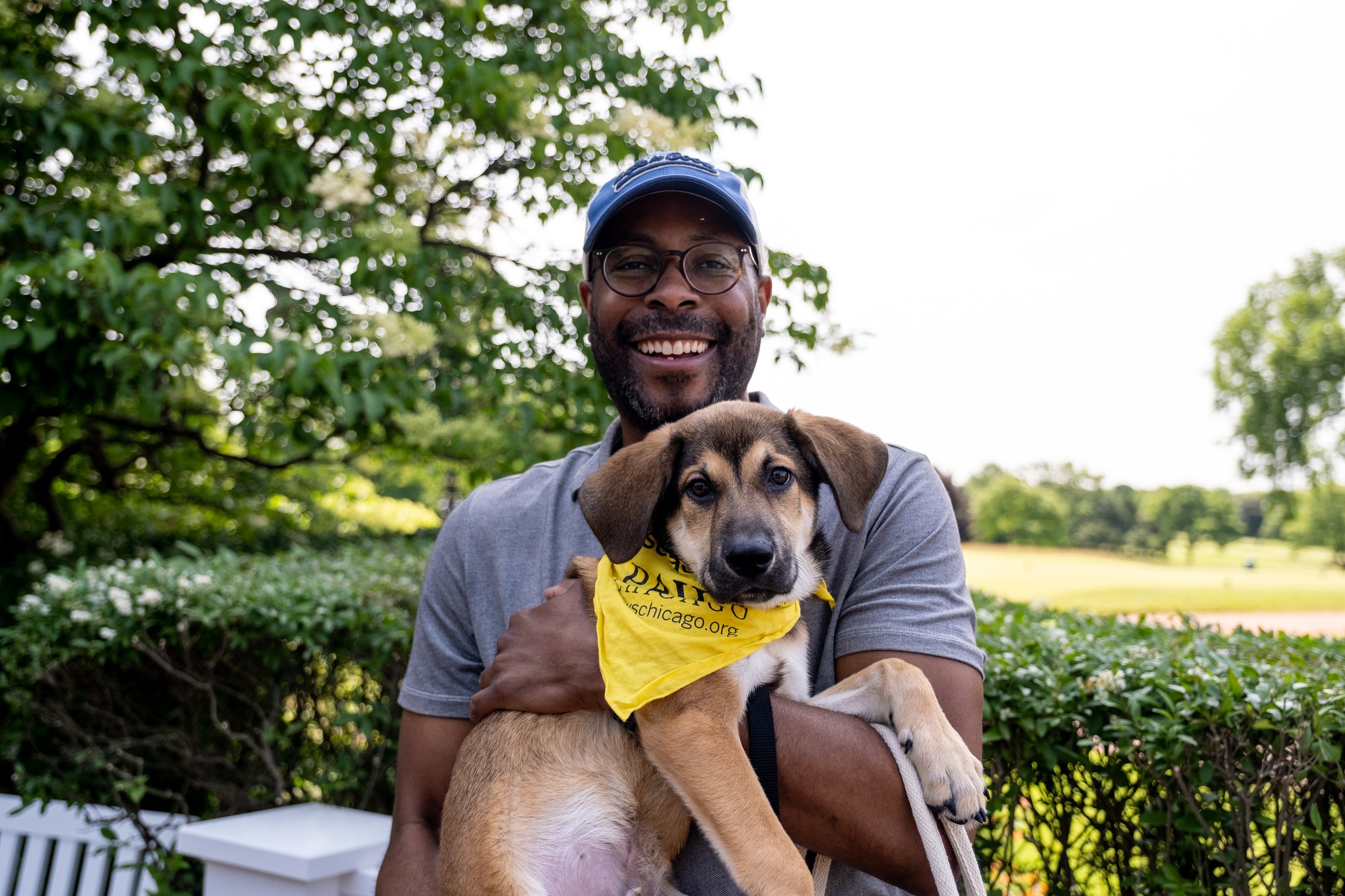
FORE!PAWS Golf Outing event branding
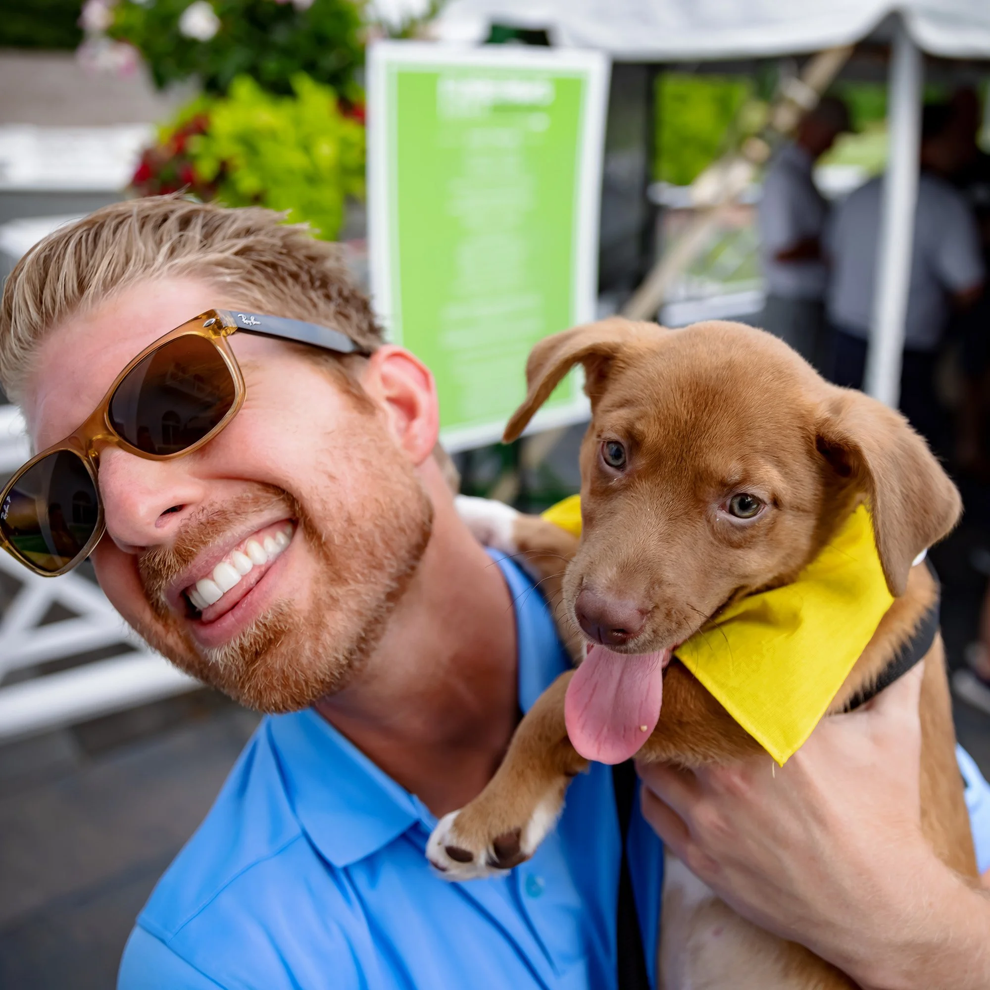
Event Overview: FORE!PAWS is a golf fundraising event supporting PAWS Chicago’s mission to build a no-kill community for homeless pets. The event brings together animal lovers and golf enthusiasts to raise funds for lifesaving programs.
Role: Lead Designer
Tools: Adobe Creative Suite (Photoshop, Illustrator, InDesign), Mailchimp (for email campaigns)
-
Develop a cohesive visual identity and event collateral to enhance brand recognition, engage participants, and drive fundraising efforts.
-
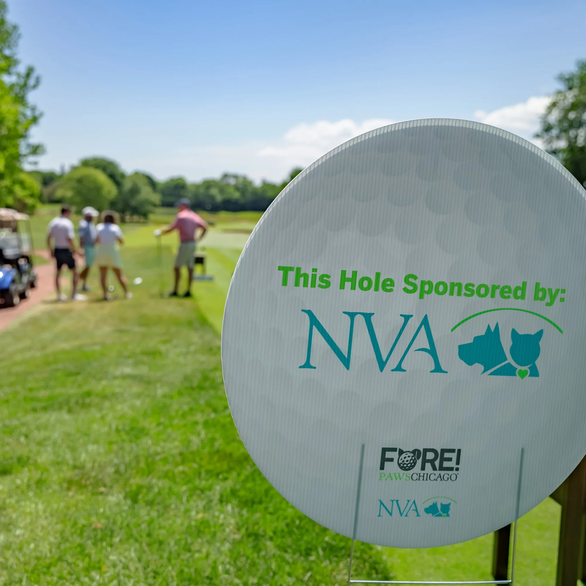
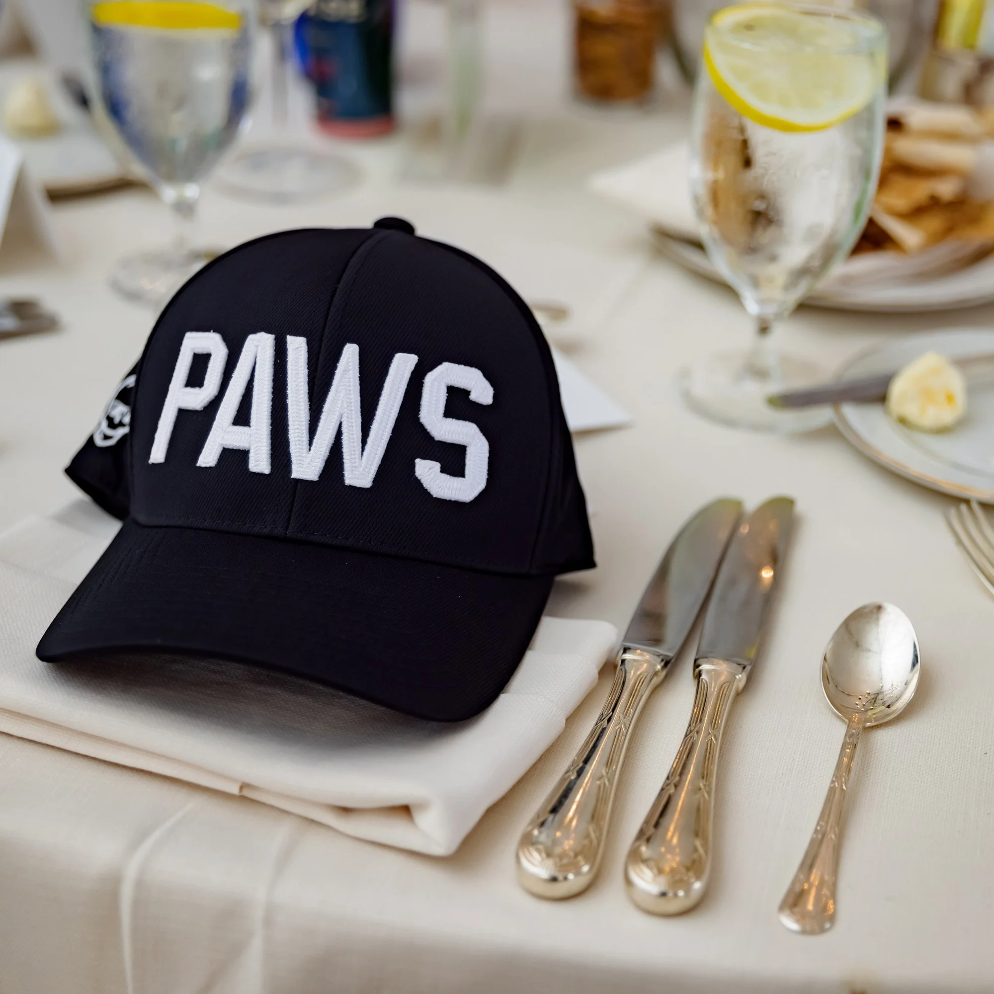
I designed the FORE!PAWS logo, establishing a fun and professional aesthetic that aligned with PAWS Chicago’s brand. From there, I created a suite of event materials, including course signage, table displays, posters, a landing page, and email campaigns. Each piece was designed to maintain a consistent look and feel while ensuring clarity and impact for event attendees.
-
The branding and collateral helped create a polished and engaging event experience, strengthening donor engagement and boosting visibility for PAWS Chicago’s mission. The cohesive design system ensured a seamless brand presence across digital and print touchpoints, contributing to the event’s success in fundraising and participation.
UI/UX Case Study:
PAWS Chicago Website Redesign
Project Overview: The redesign of the PAWS Chicago website was an enormous task, as a national leader in the "No Kill animal shelter" community, PAWS is dedicated to ending pet overpopulation, and transforming animal welfare through innovative, sustainable solutions. However, its website—intended to serve as a vital resource for adopters, donors, volunteers, and pet owners—had become overwhelming and difficult to navigate, with an excess of information that made it challenging for users to find what they needed.
This redesign aimed to streamline the site’s content, improve navigation, and create a more intuitive experience, ensuring that visitors could easily adopt, donate, volunteer, or seek pet care resources.
Role: Lead UI/UX Designer
Tools: Lucidspark, Figma
Landing page before redesign
Discovery Phase
-
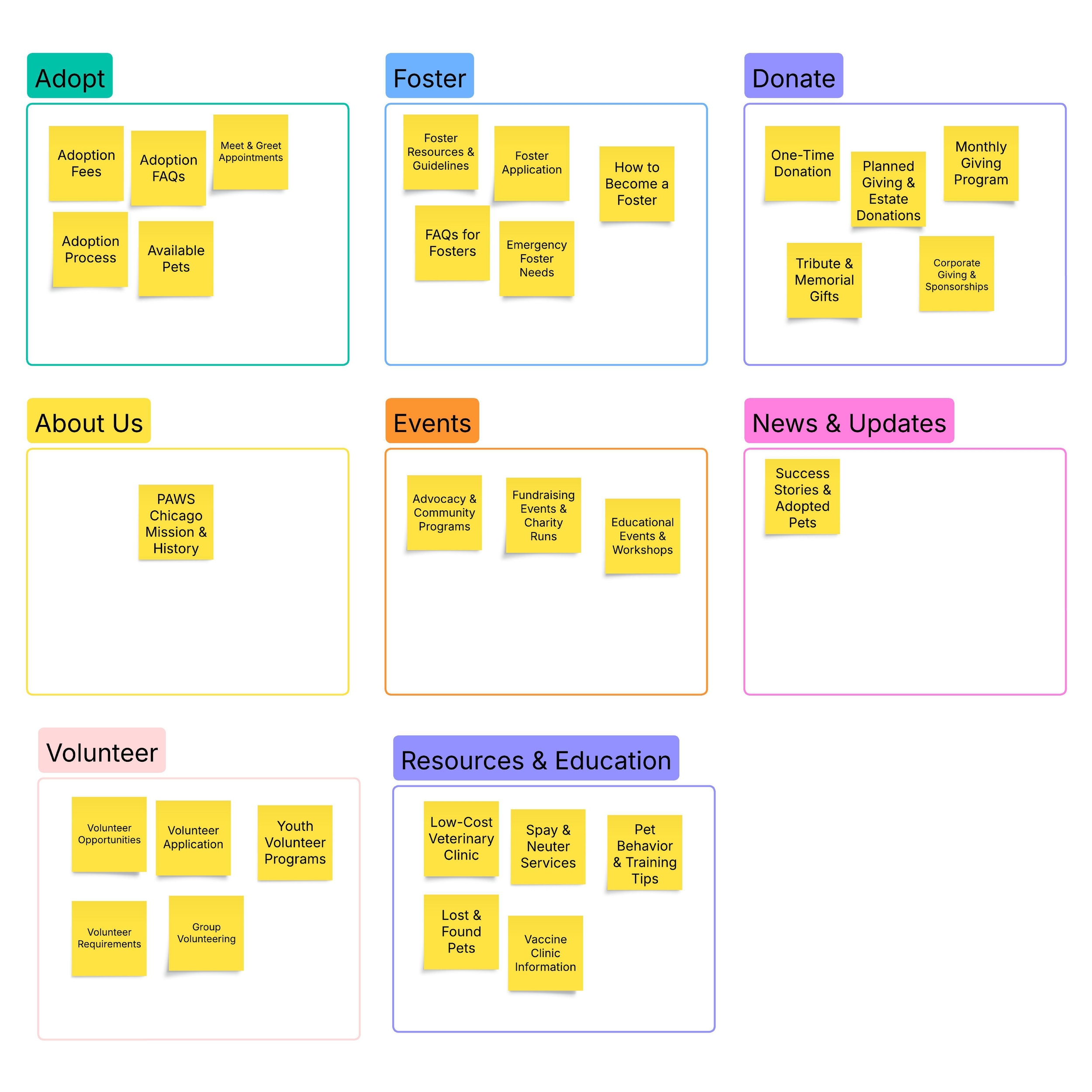
I began with an extensive audit of the existing website, assessing usability, content organization, and accessibility. A key issue identified was information overload—the site had grown into a dense collection of resources without a clear hierarchy, making it difficult for users to quickly access key actions such as pet adoption, fostering, or clinic services.
To better understand how to improve the experience, I executed a structured research process:
Competitive analysis of similar organizations, including ASPCA, World Wildlife Fund, The Humane Society of the United States, and One Tail at a Time, identifying best practices in content organization and navigation.
Heuristic evaluations to assess usability flaws.
User interviews to understand pain points and behaviors.
Affinity diagrams to synthesize insights.
And updated user personas to ensure the design reflected actual audience needs.
-
Using research insights, I restructured the information architecture to create a more intuitive layout. This involved:
Developing a new site map
Analyzing competitor navigation structures
Conducting card sorting exercises to understand how users naturally categorize and navigate information
Creating scenarios, storyboards, and user journey maps
Sketching multiple layout concepts
Designing low-fidelity wireframes and user flows
The goal was to ensure a streamlined experience that aligns with user expectations, making it easier to adopt, donate, or get involved with PAWS Chicago.
-
Once the wireframes were developed, I built interactive prototypes and conducted three rounds of usability testing. These tests helped refine the following:
Navigation patterns to reduce click fatigue
Optimizing content hierarchy to highlight the most important information
Mobile responsiveness for an improved experience across devices.
Outcome
-
With the structure refined, I moved into the visual design phase, making sure to incorporate:
A clean, approachable color palette.
Readable, accessible typography.
Engaging imagery to highlight PAWS Chicago’s mission and impact.
Consistent UI components for a cohesive look and feel.
Once receiving stakeholder approval, I worked directly with engineers during handoff, ensuring a smooth implementation and fine-tuning details for the final launch.
-
This redesign laid the foundation for a more user-friendly, accessible, and mission-driven website, streamlining the adoption, donation, and volunteer processes while improving access to pet care resources. By simplifying navigation and enhancing the overall user experience, the new design ensures that visitors can more easily engage with PAWS Chicago’s lifesaving mission. While the website is still in development, these improvements are set to make a lasting impact, helping PAWS Chicago connect more people with rescue animals and continue its vital work in saving lives.
Wayfinding Maps
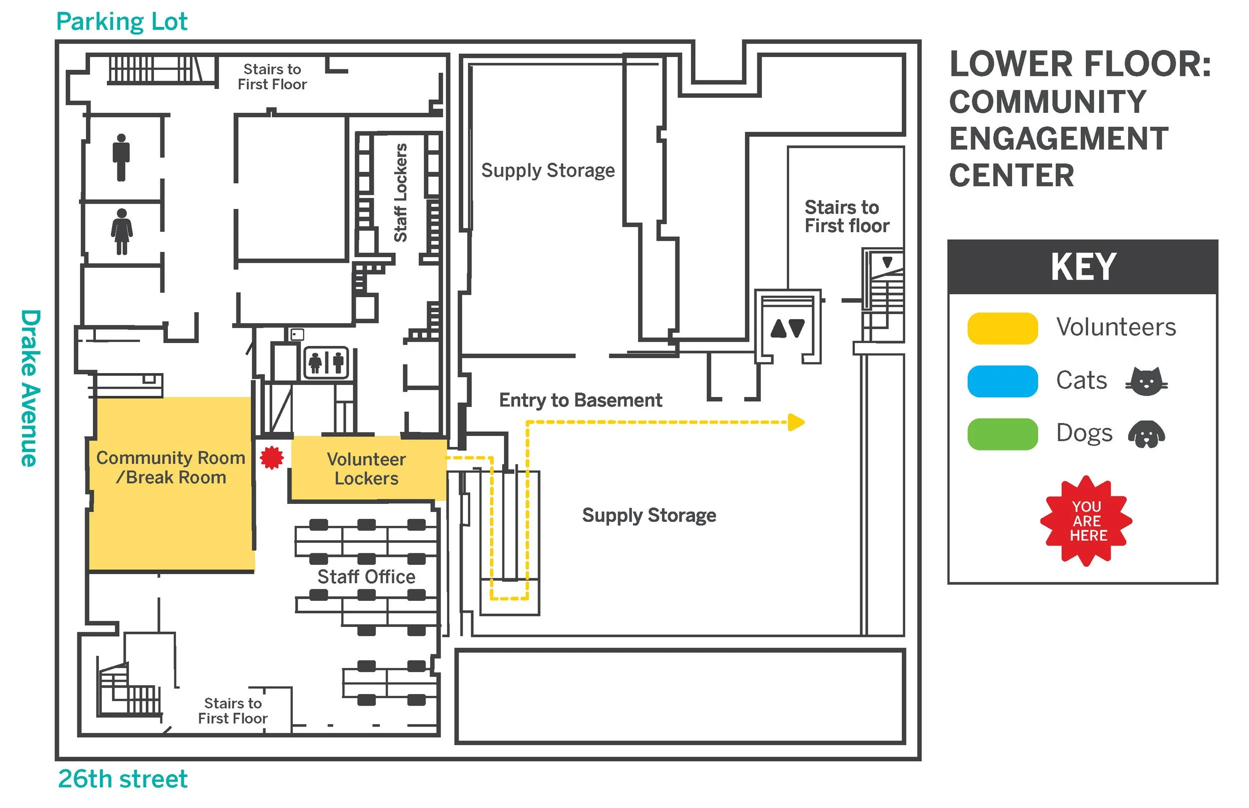
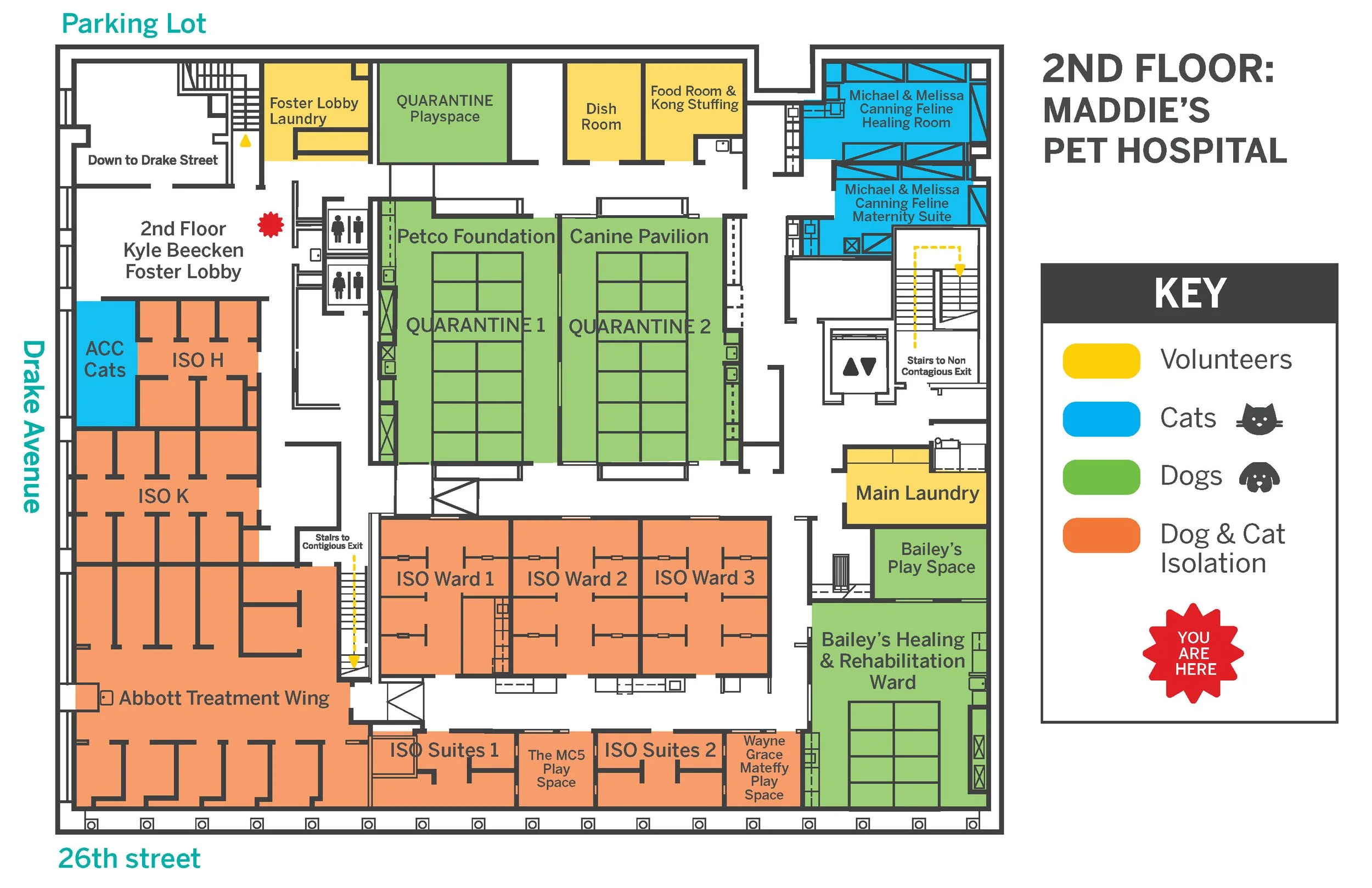
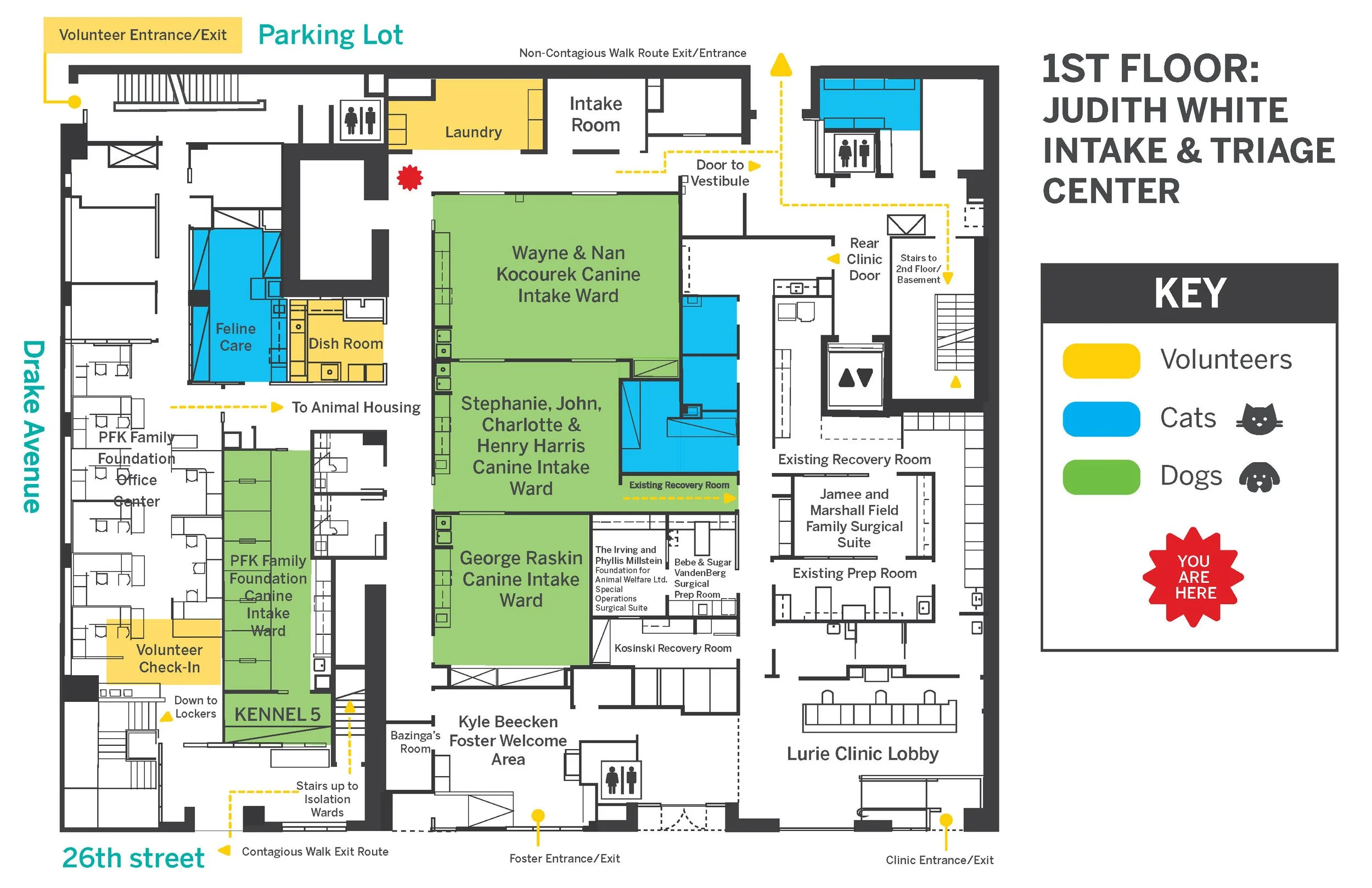
Project Overview: This project involved the design and implementation of wayfinding maps for PAWS Chicago’s Medical Center. The goal was to create clear, easy-to-navigate maps that would help visitors and staff quickly find their way around the facility. The project included the design of both print and digital map systems that integrated seamlessly with the existing branding and infrastructure of the Medical Center.
Role: Lead Designer
Tools: Adobe Illustrator
-
Research & Mapping: I started by conducting a thorough analysis of the Medical Center's layout, identifying key areas that needed to be highlighted on the maps. This included patient rooms, waiting areas, medical offices, and support services.
Design & Prototyping: Created both digital and print map layouts, ensuring they were accessible and easy to read. The design incorporated PAWS’ brand colors and typography to ensure consistency with the overall identity.
Stakeholder Collaboration: Worked closely with the medical center’s operations team to ensure the maps accurately represented the building’s layout and would be practical for real-world navigation.
Testing & Iteration: Conducted usability testing to ensure the maps worked as intended, making adjustments to improve clarity and visual appeal based on feedback from staff and visitors.
-
The wayfinding maps significantly improved the navigation experience at the Medical Center, helping visitors and staff find their destinations quickly and with confidence. The project not only enhanced operational efficiency but also strengthened PAWS Chicago’s brand by presenting a professional, cohesive look across both physical and digital platforms.


